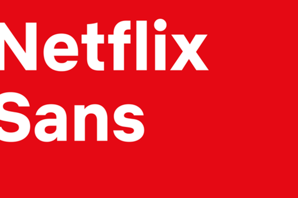
Netflix has a new font and the company claims it’s going to save it millions
New font also creates an ‘ownable’ unique element for the brand, says designer

By Lucy Handley
Streaming giant Netflix has created its own typeface, just like other tech companies have done.
Netflix Sans is the name of the bespoke font, while Apple’s is called San Francisco, introduced at its developer conference in 2015. Samsung announced SamsungOne in July 2016.
Why? Because it will save Netflix marketing dollars, as using fonts often attracts large licensing fees, according to its brand design lead Noah Nathan.
“With the global nature of Netflix’s business, font licensing can get quite expensive,” he told design website It’s Nice That on Wednesday. “Developing this typeface not only created an ‘ownable’ and unique element for the brand’s aesthetic … But saves the company millions of dollars a year as foundries move towards impression-based licensing for their typefaces in many digital advertising spaces.”
Netflix designed the new font in partnership with Dalton Maag, a foundry that licenses its typefaces around the world. And while having a bespoke font may save the company millions, that is a drop in the ocean as its overall marketing budget will hit US$2 billion this year, up from US$1.8 billion in 2017.