Advertisement
Advertisement
Architecture and design
Get more with myNEWS
A personalised news feed of stories that matter to you
Learn more
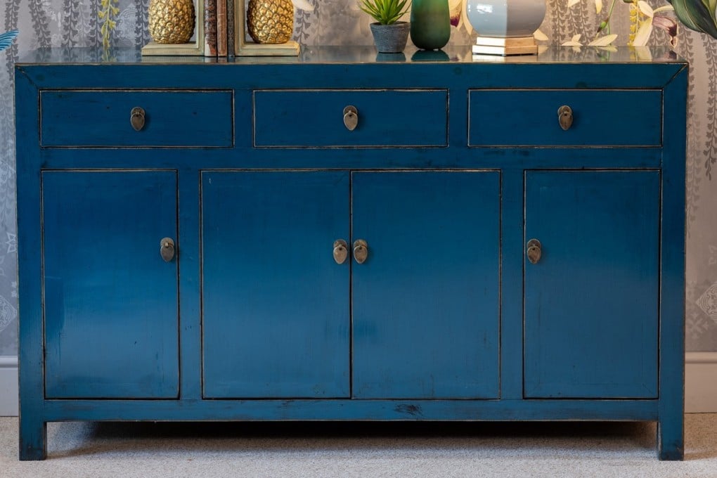
A distressed Chinese sideboard finished in a cobalt blue lacquer from Orchid Furniture in the UK. Photo: Orchid Furniture

Design trends for 2020: ‘classic blue’ and curved furniture to ‘healthy’ interiors and shabby chic

  • Pantone has picked ‘classic blue’ as its colour for 2020 because it stands for ‘protection, stability, peace and confidence’
  • Demand will also increase for interiors that reflect nature, use rounded edges and where opposites attract
Have you been devouring magazines, blogs and websites for the next big thing this year in home interiors? Because we all know that forecasting trends is fodder for the style savvy when a new year – let alone a new decade – dawns.

The annual predictions begin in early December when colour authority Pantone announces its “colour of the year”. Designers then weigh in with their opinions and predictions. But what purpose do such forecasts actually serve?

Designer Eve Mercier concedes that there is an element of product marketing involved, but she understands why some people slavishly follow trends.

“Interior design is quite a new field in Asia,” says Mercier, founder of the Insight School of Interior Design. “A lot of people are unsure of how to furnish their home, so if they see a trend in a publication, they think: ‘These people must know better than I do, therefore I’m going to believe them.’”
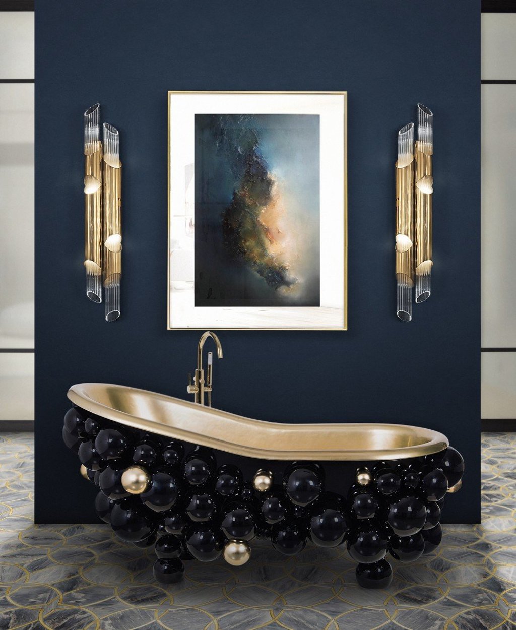
The designers of this bespoke bathroom used Pantone’s colour of the year – “classic blue” – as the backdrop. Photo: Maison Valentina

When Mercier first lived in Hong Kong 20 years ago, she felt that “nobody cared about interiors or design in general”. Living quarters were small, and people tended to go out to socialise. “When I came back seven years ago, to open the school, I could really see this was changing,” she says.

Now a small flat can be a decorating advantage, Mercier asserts. “The accent is on how to be practical, and clever, to maximise the space,” she says. “Practicality is important, but not an end in itself: you still need to make something that is beautiful on the eye and feels good by interacting with all five senses.”

As shown in this living room suite by Portuguese furniture brand Laskasa, subtle use of Pantone’s classic blue can work well in a home interior. Photo: Maison Valentina

So, how will Pantone’s colour of the year for 2020 – “classic blue”, which Pantone says is “meant to symbolise protection, stability, peace and confidence, as well as encourage deep thinking, open mindfulness and communication” – gel in Hong Kong homes?

Not very well, in Mercier’s opinion.

She understands its relevance. “In colour psychology, blue is associated with calm and balance,” she says. “With the whole world living in a hectic time, I don’t think that [choice] is a coincidence.” But the deep-cobalt classic blue is a strong primary colour, and “quite difficult to use” in residential interiors, she adds.

Navy and gold team up for 2020 in this made-to-measure wallpaper mural from Wallsauce.com. Photo: Wallsauce.com

For those wishing to follow this trend, she recommends opting for “little touches”, or a variation of the shade. Mercier does not see classic blue being as popular as Pantone’s “living coral” was in 2019.

Aside from colour, Mercier thinks that three key themes – individuality, eclectic and back to nature – will shape interiors in 2020.

She sees a move away from the “safe” environment of a white or beige palette, to “something which is a bit risky, quirky and fun”.

“People are becoming more adventurous,” she says.

This trend morphs into the eclectic genre. In pursuit of the “perfect look”, people in Asia have shied away from anything second-hand, vintage or slightly distressed, but that, too, is changing. “I think this kind of shabby chic is definitely something that is growing here,” she says.

Back to nature is certainly not new, but enduring, she adds. House plants are a must – “according to feng shui principle, you have to have greenery inside” – and Mercier sees increasing demand for “healthy” interiors with eco-friendly finishes.

Classic blue, Pantone’s colour of the year, symbolises “protection, stability, peace and confidence”.

Alex Sheldon, founder of The Home Stylist, offers a few more tips.

The first is curves. “Influenced by the geometry and glamour of the 1970s, rounded edges are very in when it comes to furniture in 2020,” she says. To get the look, add a curvaceous statement chair and a retro circular side table to your living room.

Texture “in all its variety” will be a decor trend for the coming year and beyond, predicts Sheldon, and with this look, opposites attract.

“Metallics are still in for 2020 and the more mismatched, the better,” she says. “Mixing copper, brass, gold and wrought iron in your furniture, fixtures and fittings keeps things exciting and allows you to play around with your colour palette.”

A Riley modular sofa in classic blue from Satara Australia. Photo: Satara Australia

The same applies to wood: contrasting dark and light wood in the home is a key look of the new decade.

“All woods go together [as they have] the same underlying tone,” Sheldon says.

She agrees that bringing nature in is another interior trend that is here to stay. “Think outside the box with terracotta, coral and plenty of plants.”

Post