1980s Hong Kong apartment gets a child-friendly makeover that’s modern and elegant
Designer Norman Ung doesn’t let flat’s structural walls get in the way, creating a contemporary family home with spacious living areas, a generous master suite and a dining room that doubles as guest room for grandma’s visits
In the right hands, a property’s limitations can turn out to be its strengths. When architect Norman Ung Wai-lun, co-founder of Deft, was commissioned by an old school friend to turn a large 1980s Mid-Levels apartment into a two-bedroom, two-bathroom contemporary family home, its constraints soon became clear: the five structural walls carving up the flat.
In puzzling out how to open up the space around those immovable objects, Ung came up with an ingeniously flexible plan to suit the lifestyle of this family of three. His brief was straightforward: the owners wanted a grand master suite, a bedroom for their baby daughter and a guest room for frequent visits from Grandma. They also wanted to retain the apartment’s huge living spaces, create a library wall (with ladder) and ensure the interior was both child-friendly and sophisticated.
Ung may have had 2,350 square feet to play with, but given the structural walls, it was a big ask.
His solution was to combine two of the original three bedrooms into a large master suite and streamline the formerly convoluted flow. A structural wall meant Ung was unable to fully open the kitchen to the dining room, so he blocked the old door between the two and opened up the kitchen to the entrance hall and living area instead. Changing the access allowed the dining area to double as a guest room, with a drop-down bed, hidden bi-fold door and pullout blackout curtain.
“Our key design approach is that, no matter how big or small the space, we try to squeeze the most out of it, to give it flexibility,” Ung says.
The design of many dual-function spaces can seem a bit, well, clunky, but not here. As a dining area, it flows seamlessly into the living room, the sweep of floor tiles interrupted only by a discreet metal track for the sliding door to indicate that there might be more to the space than meets the eye.
It is sleek and grown-up, with dark wallpaper creating a cosy night-time atmosphere and a dark-wood dining table, which converts to a poker table for boys’ nights. A wall of dark veneer cabinetry is punctuated by a built-in marble-topped sideboard and section of concrete feature wall. Similar materials – dark wood, concrete, marble – reappear in the kitchen.
“We rarely work in such large spaces, so we were happy to experiment with a darker palette than usual,” Ung says. “We try to respect the integrity of the materials, so the concrete looks like concrete and the wood grain [in timber] is visible. It’s typical of our style. We tend to go simple and minimalist.”
Ung has made a feature of the chunky structural wall separating the dining room and entrance hall, with corners as rounded, smooth and pristinely white as royal icing.
“There are rounded corners throughout the apartment, to make it safe for the baby,” Ung says. “Another key element of the design was the wall unit in the living room – they really wanted it to have a ladder, like a library. So we designed it as a set of boxes, some with doors and some open. The whole space is monochrome – black, grey and white – which works well with their exotic pieces. Colour is provided by books, art and soft furnishings.”
This being the first time the couple has lived together, they were keen to add their personalities to the furnishings. So they went shopping, buying pieces that pop against the muted backdrop.
“They chose all the furniture themselves, we just gave them the dimensions,” Ung says.
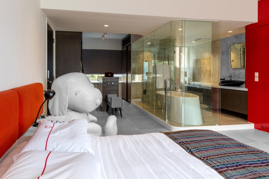
An exception to the monochrome colour scheme is in the huge master suite, its dimensions dictated by more structural walls. Created from two former bedrooms and a bathroom, the space was kept as open as possible, with a glass-walled en-suite bathroom and large dressing area, complete with glass-topped island offering a bird’s-eye view of neatly rolled ties and belts in their own little compartments.
But what really catches the eye is a floor-to-ceiling cupboard in bright red.
“We matched the colour to the couple’s headboard and red ceiling lamp,” Ung says. “It was built specifically for her collection of designer handbags.”
Living room detail High on the brief was a movable bookcase ladder, to give the back of the living room the feel of a library.
TRIED + TESTED
Set the bar When Grandma comes to stay, the dining room is converted to a guest room by pulling out the bi-fold doors and dropping down the bed. Which means the family no longer has a dining table. To solve this problem, Norman Ung, of Deft, devised a pullout section for the breakfast bar.
“Our designs always involve pieces that move,” he says. “And it works really well as a bar at parties.”