The ‘father of Hong Kong design’ Henry Steiner on creating the HSBC logo, Standard Chartered banknotes
Henry Steiner, who arrived in Hong Kong on a nine-month contract and never left, says he was the first person in the city to call himself a graphic designer
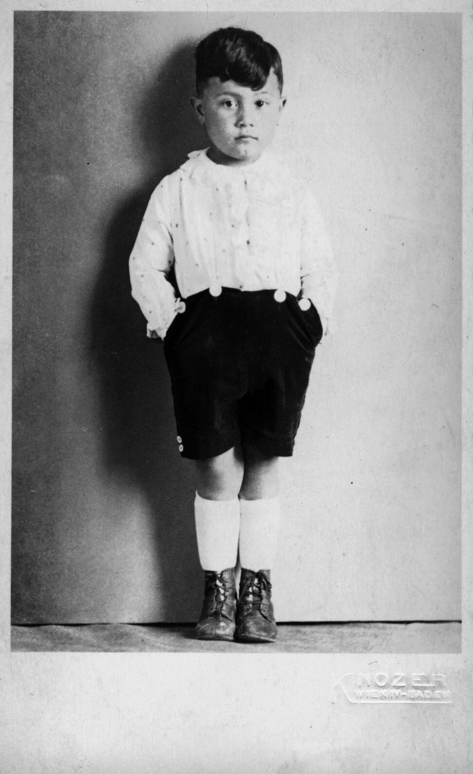
Ticket to America: I was born in Vienna, in 1934. My father was a dentist, my mother was a seamstress, and we lived in Baden bei Wien, a spa town southwest of Vienna. I had a pleasant enough early childhood, but in 1938 came the Anschluss, the annexation of Austria by Nazi Germany.
My mother was very concerned and started searching desperately for a way to get us out of Austria. She heard about an American-Austrian Hollywood film producer who summered in Baden and knocked on his door and said she wanted an affidavit from him to go to the States. He said he’d received many similar requests. She pulled out a picture of me and said, “If not for me, then for my son.” He said, “How can I refuse this little Chinese boy?”
So, that was how we got out. We went by ship to New York and arrived in 1939. My father found it difficult to adjust to life in New York. He ended up as a dental mechanic, making dentures, and my mother remarried.
Thought provoking: For my bar mitzvah, I was given a book called Adventures in Time and Space and that got me interested in science fiction, which was wonderful escapism. I went to Stuyvesant High School and from early on began drawing caricatures and illustrations. When it came time to decide what to study at college, I was torn between writing and illustration, but decided it was easier for me to draw one picture than write 1,000 words, so I went in that direction.

I went to Hunter College, which had a very good art department. When it came time to graduate, the Hungarian printmaking teacher Gabor Peterdi asked me what I most enjoyed in college. I told him it was the extracurricular stuff, being art editor of the student magazine and yearbook, and I’d also written a play. He told me Yale University had started a design department and asked if I’d like to go and study graphic design. I said, “Yes, sure, but what’s graphic design?” He said it was printing, reproduction, typography – all the things I had been interested in.
Yale saved my life – at least career wise – because it gave me an ethos, a sense of putting my talent to work. In my second year, in 1956, I was taught by Paul Rand, who had written a book called Thoughts on Design, which I’d read voraciously. He gave me my tools – contrast, idea – that you needed in design, so it was not just decoration and illustration, but thoughtfulness.
Go east, young man: I graduated from Yale in 1957 and went to work at an advertising and design company on Madison Avenue – it was the Mad Men days. A former Yale roommate had got a Fulbright Fellowship to Paris and encouraged me to do the same. I applied and got it, so I had a year in Paris and then stayed on for another.
When I got back to New York, Alan Fletcher, who I’d studied with and who went on to found (design firm) Pentagram, introduced me to several journalists and people who were selling advertising. One of them was flirting with The Asia Magazine, a weekend supplement that went out with English-language newspapers across Asia and was printed in colour, a big deal at the time. I became the design director.
The account executives began moving to Asia and in 1961 it was my turn. I wasn’t sure how long to go for or how much to ask for, so I asked a colleague, who was also Viennese Jewish, and the art director of Esquire magazine. Calmly he said, “Go for nine months and ask for US$1,000 a month.” I thought that was an enormous figure, but they said OK and I was on my way to Hong Kong.
Hello Hong Kong: My nine-month contract was extended to two years and almost 60 years on I’m still here. Hong Kong in 1961 was quaint, a little primitive, but the people had the can-do spirit they still have. I stayed at the Imperial Hotel and then moved into a flat on Seymour Road. I met a young woman who was also working on the magazine, Leela. She was a Sikh from India but educated in the States. We married and had two sons.

The magazine’s offices had been designed by an American interior designer, Dale Keller. He was working on a new hotel called the American Hotel and asked if I’d do the graphics. I did something with an “A” on the top of an “H”.
As the building was still being finished off, it was sold to Hilton and they needed a logo change. I doubled the H, so you had one on top of the other, and it had the virtue of looking like a character from the I Ching (a Chinese classic). That got me a reputation as someone who could design for hotels.
I was the first person in Hong Kong to call himself a graphic designer because all they knew at best was commercial art
Cross appeal: I was the first person in Hong Kong to call himself a graphic designer because all they knew at best was commercial art. I was a designer and making people aware of that was part of the task. I did a lot of corporate identity including for Hongkong Land.
I did HSBC’s annual reports for about a decade and finally they thought it was time to look at their corporate identity. The red-and-white hexagon is based on the company’s flag, or their “hong” flag because all the hongs – Swire, Jardine Matheson – were essentially Scottish and the company flags were based on the St Andrew’s cross.
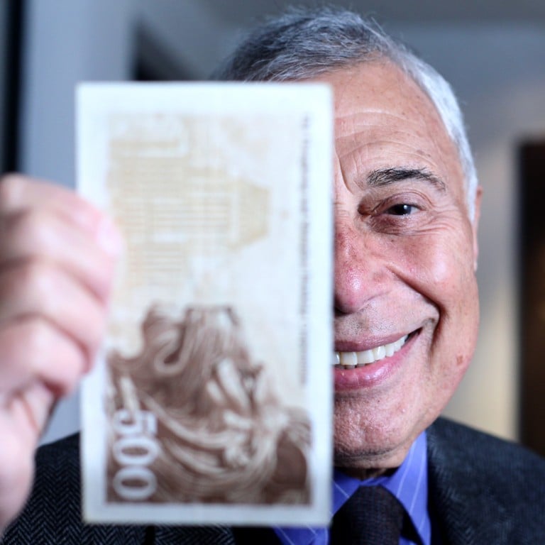
Gaining currency: A friend who was working for Standard Chartered asked if I could redesign the banknotes. Beginning in 1979, I’ve created several series of notes for the bank. Usually banknotes have a picture of someone, but in Hong Kong that was difficult – should that person be British or Chinese? So, I decided on mythological Chinese animals.
They are in a hierarchy – the dragon fish at the bottom (HK$20) and the dragon on the HK$1,000 note. I also worked for a while for the Far Eastern Economic Review and for a year I did the covers for Asiaweek magazine.
My babies: I’m known as the “father of Hong Kong design”, which is nice, except not all my offspring are legitimate, but I have enough that I’m proud of. In design terms, there is still a lot of primitive, basic stuff out there, mainly due to clients who want to save some money – it looks fine to them as long as you have the name or their face big – but Hong Kong has become much more sophisticated.
I was divorced in 2000 and since then have lived in a hotel in Sai Ying Pun. I think of Sai Ying Pun like Shakespearean London, the bustle of people selling their wares. I give lectures from time to time and have had a number of retrospective exhibitions in recent years.
I’m going to have an exhibition at the Museum of Applied Arts, in Vienna, in 2023, and M+ has taken a lot of my archives – the nice thing about being a graphic designer is that you usually have multiples of your work, so it’s not like selling my children.

