Advertisement
Advertisement
Advertisement

Xiaomi’s new ‘squircle’ logo? Subtle rebrands are nothing new – from Celine to Burberry, 6 luxury brands that made big statements with tiny design tweaks
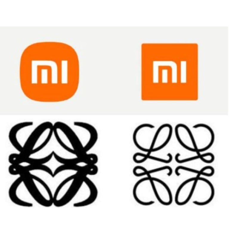
Xiaomei and Loewe: subtle logo changes over then and now. Photos: XiaoMi/Weibo, handout

It might seem like an April Fool’s joke but it’s legit: Chinese electronics company Xiaomi announced at the presentation of the Mi Mix Fold that it has changed its logo as part of its brand identity overhaul.

Xiaomi’s logo change in March 2021. Photo: Xiaomi/Weibo

Xiaomi’s logo is now a curved-edge “squircle” rather than a square, although the company’s CEO Lei Jun says that it wasn’t simply a matter of “[changing] the shape from square to round”. Nope, instead it took the brand some considerable time to pick the right shape, even using mathematical equations, the culmination of a long process begun when the company started its rebranding in 2017.

They are not alone – the luxury world has also seen its share of logo changes over the years, ranging from subtle to, well, not so subtle. Here are some of the most memorable logo rebrands of our times.

Celine

In September 2018, Celine announced that it had launched a new logo.


The brand even deleted its Instagram history for this fresh start, heralding the arrival of Hedi Slimane and bidding goodbye to Phoebe Philo’s creative direction. The logo change was a subtle one: to the naked eye, it seems like the brand simply took the accent off the e, thinned out the letters and pushed them closer together (what we in the industry call kerning).

Celine’s logo change in September 2018. Photo: handout

Celine’s announcement emphasised that “the new logo has been directly inspired by the original, historical version that existed in the 1960s”, and while we can’t say it’s the most drastic of changes (as netizens have pointed out), one could argue that the tighter typeface has more visual impact.

The appeal of a bold, capitalised logo is certainly one shared by many luxury brands, as you can see from the following examples that also came out around that time.

The Bold Bs

There seems to be a pattern here.

The logo changes of Burberry, Balmain, Berluti and Balenciaga, with the old one on top and the new one below. Photos: handout

Gone are the delicate scrolls, the cursive script and the stylising of font; enter the era of big, bold logos. Sans serif is king and the overarching theme here seems to be impact, impact, impact.

Balenciaga’s redesign came in September 2017 during the presentation of its spring/summer 2018 ready-to-wear collection, and the plus-sized change was “inspired by the clarity of signal signs found in public transport”, according to the brand’s statement.

Berluti took a similar route in June 2018. According to owners LVMH, the logo change marked an important step by Kris Van Assche, who had just been appointed as Berluti’s artistic director in April that year.

“He has made his first imprint on the heritage of the Parisian brand, which has also redesigned its visual identity,” the press release said. “The designer drew his inspiration from the brand’s origins. The new ‘1895 Berluti Paris’ logo features the brand’s name as it was carved onto an ‘Alessandro’ shoe tree, which is then accented with the year the founder established himself as a shoemaker. The corners of each letter have been subtly erased to signify new beginnings.”

Two months later in August 2018, Burberry jumped on the bold wagon with its new look.


The reactions on the brand’s Instagram post were mixed, with some applauding the brand’s brave new step towards modernity, while others missed the more historical quality of the previous font and styling.

Balmain wasn’t going to miss out. It bookended the year of bold logos with a redesign of its own in December 2018. In all fairness, given that the brand has had the same logo for 70 years, it was probably due an update.

By now, luxury fans had gotten used to the serif nixing and the bolding of font, but Balmain gave them something else to think about with the new “B” logo that incorporates both B and P – after founder Pierre Balmain and Paris, where the brand’s headquarters are situated.


“This new B, echoing some of Pierre Balmain’s mid-century monogram designs, works well for patterns and adornments for the house’s many collections,” says brand creative director Olivier Rousteing. “My team and I look forward to exploring new ways to incorporate it into future designs.”

While some netizens joked that the new “B” logo reminded them of bitcoin, others pointed out that there were certain similarities to the Laura Biagiotti logo.


Balmain released a statement soon after addressing the similarity and “possible interference”.

Loewe

Then there are those who went the opposite route. In 2014, Loewe announced an “unveiling of a new visual identity”.

For all intents and purposes, it looks like a slimmed down version of the former logo. According to the brand, the new logo ties in with the arrival of new creative director Jonathan Anderson in September the year before, and is “inspired by the work of German-born British typographer Berthold Wolpe, whose trajectory echoes that of Enrique Loewe Roessberg, founder of the house. The creative, contemporary and refined élan evokes the past, present and future of Loewe”.

Want more stories like this? Sign up here. Follow STYLE on FacebookInstagramYouTube and Twitter.

Xiaomi
  • Not an April Fool’s joke: Chinese smartphone giant Xiaomi announced a new logo at its Mi Mix Fold presentation as part of a long-awaited brand identity overhaul
  • Following Burberry, Berluti and Balenciaga, 2018 saw Balmain switch up to a bolder, more impactful logo – that some netizens said reminded them of bitcoin’s