Redesign of Chinese University emblem sparks heated words between lawmakers and alumni in Hong Kong
- Lawmakers accuse Chinese University of stripping away important cultural nods following unveiling of new crest
- But some alumni say change is for university’s greater good, warning legislators not to politicise redesign
A redesign of the crest of the Chinese University of Hong Kong has sparked a debate among legislators accusing the institution of poor governance and some alumni warning against politicising the rebranding.
Some lawmakers, who also sat on the institution’s governing council, on Tuesday said they were shocked to discover the city’s second-oldest university had updated the emblem, accusing the institution of removing elements fundamental to Chinese culture without conducting a consultation beforehand.
“It treats us as if we, the governing council, are dead,” legislator Tommy Cheung Yu-yan said.
But a university spokesman said the changes were discussed with the governing body at an event last year, with members also invited to share their views during a consultation period.
“The university also handed the final proposal to the executive committee of the governing council at a meeting on September 22,” he said.

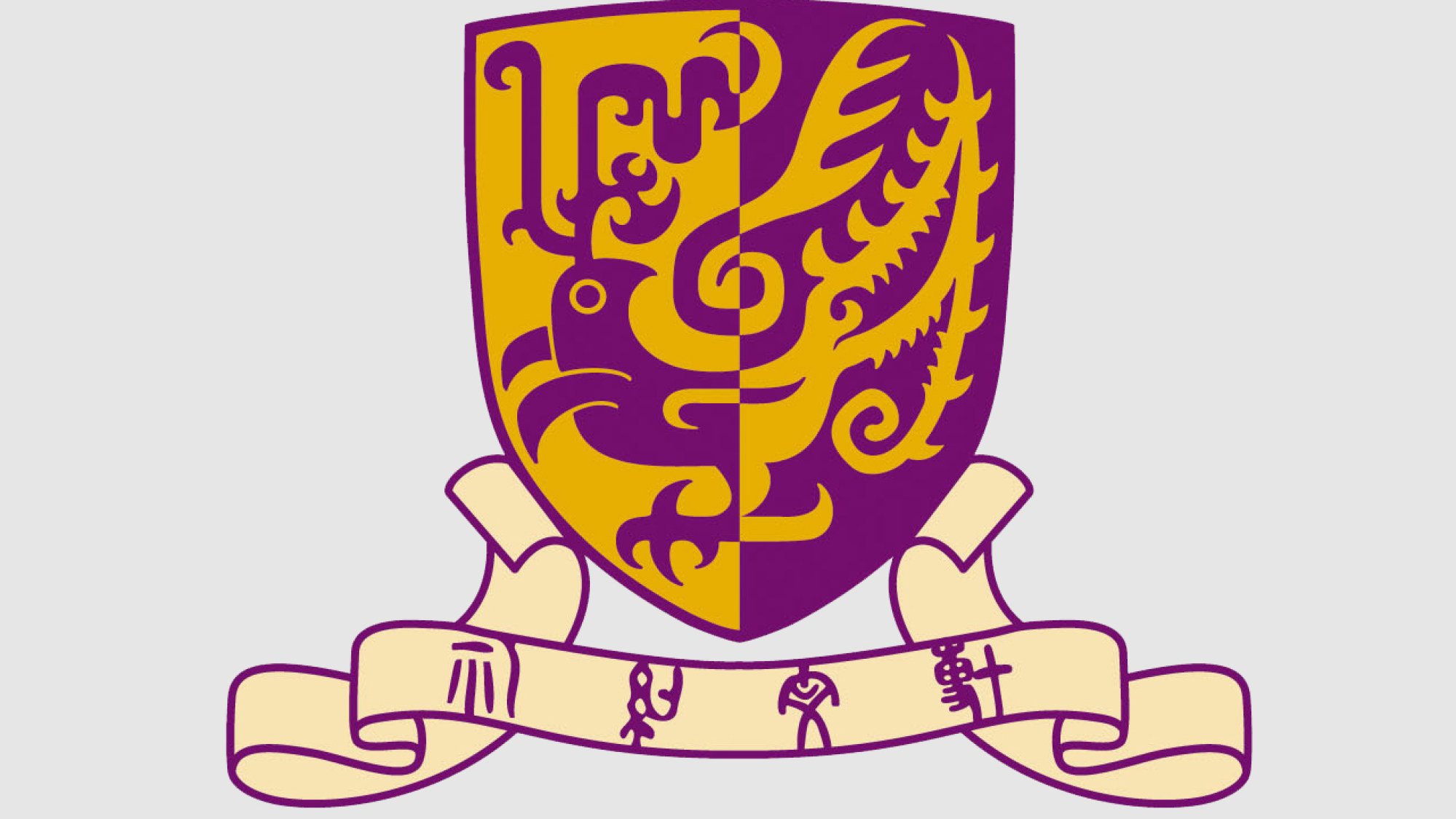
The new emblem, which was revealed on Monday, features a golden phoenix on a purple background. The redesign retained the colours and symbol of the old version, but no longer halved the shield to apply the purple and gold in a reversed format.
The redesign was unveiled to celebrate the 60th anniversary of the university’s founding and marked the fourth time the crest had been changed since 1964.
Heung Shu-fai, an alumni and university council member, on Tuesday defended the decision, arguing it was for the greater good of the institution and hitting back at those who framed the change in a political context.
“It was all for the promotion of Chinese University, and yet someone has politicised the matter. It pained all the academics to see that,” he said.

Bill Tang Ka-piu, one of three lawmakers on the council, said he questioned the need for the redesign as many believed the original design had contained a nod to the Taoist concept of “yin and yang”, symbolising the importance of balance.
The university council consists of 59 members, which include top management and academics. The body also features “laymen” from outside the campus, including three seats set aside for legislators. None of the lawmakers hold a position on the body’s 10-person executive committee.

The new crest also came with a “simplified version” for use on social media platforms, which removed the university’s motto written in four Chinese characters that stated: “Through learning and temperance to virtue”.
A formal iteration retains the words and will feature on official documents and campus buildings.
But Tang said the words, originally from Confucius, symbolised the university’s deep connection with Chinese culture. The lawmaker added that he looked forward to a brief session of the university council next week, where they would hear the reasons for the changes.
Fellow lawmaker and council member Cheung said he was upset by the change and the manner in which he learned about it, accusing the university of a lack of transparency over the change.
“I read about it in the news on Monday,” he said, adding that such an arrangement stopped short of good institutional governance.
Cheung added that he was also not informed about which design company had spearheaded the changes, the underlying reasons for them, or how much they would cost to implement.
But Heung urged his fellow members to discuss any grievances they had in a calm manner, so as to prevent harming the university’s reputation. The alumnus also noted that the new emblem maintained the gold and purple of the old one, which could still be seen as a nod to yin and yang.
Regarding the removal of the motto for the simplified version, the radio host also explained that the streamlined crest would be used when necessary. Heung said many people would be unlikely to read the university’s motto if they were using a phone or tablet, noting that many top universities around the world had done the same.
“The simplification actually doesn’t take away anything,” he said, adding that most alumni would already know the motto by heart.

Lawmaker Priscilla Leung Mei-fun, an alumna and the chair of the Legislative Council’s education panel, said she had heard a lot of complaints from her university peers over the redesign, despite not holding a position on the campus’ governing body.
“Chinese University doesn’t just represent the Chinese language, but also the humanities of China,” she said, adding the view was one shared by many previous vice-chancellors.
“We hope that the school will respect the efforts of previous alumni, not just go with the flow.”
Members of Hong Kong’s pro-establishment camp had already singled the university out after its campus became the site of clashes between police and anti-government protesters during anti-government protests in 2019.
Former leader Leung Chun-ying, who was among those who had previously hit out at the university, on Tuesday also weighed in on the debate, accusing vice-chancellor Rocky Tuan Sung-chi of treating the institution as if it were his own.

