Chinese University of Hong Kong president agrees to drop crest redesign after pro-Beijing lawmakers complain of ‘lack of consultation’
- Governing council endorses move, with trio of lawmakers appointed to body saying they have demanded independent investigation into redesign
- University unveiled new crest last week without properly consulting council in ‘black box affair’, they claim
The head of Chinese University of Hong Kong has recommended going back to its previous crest after a redesign drew criticism from the city’s pro-establishment camp, a decision endorsed by its governing body.
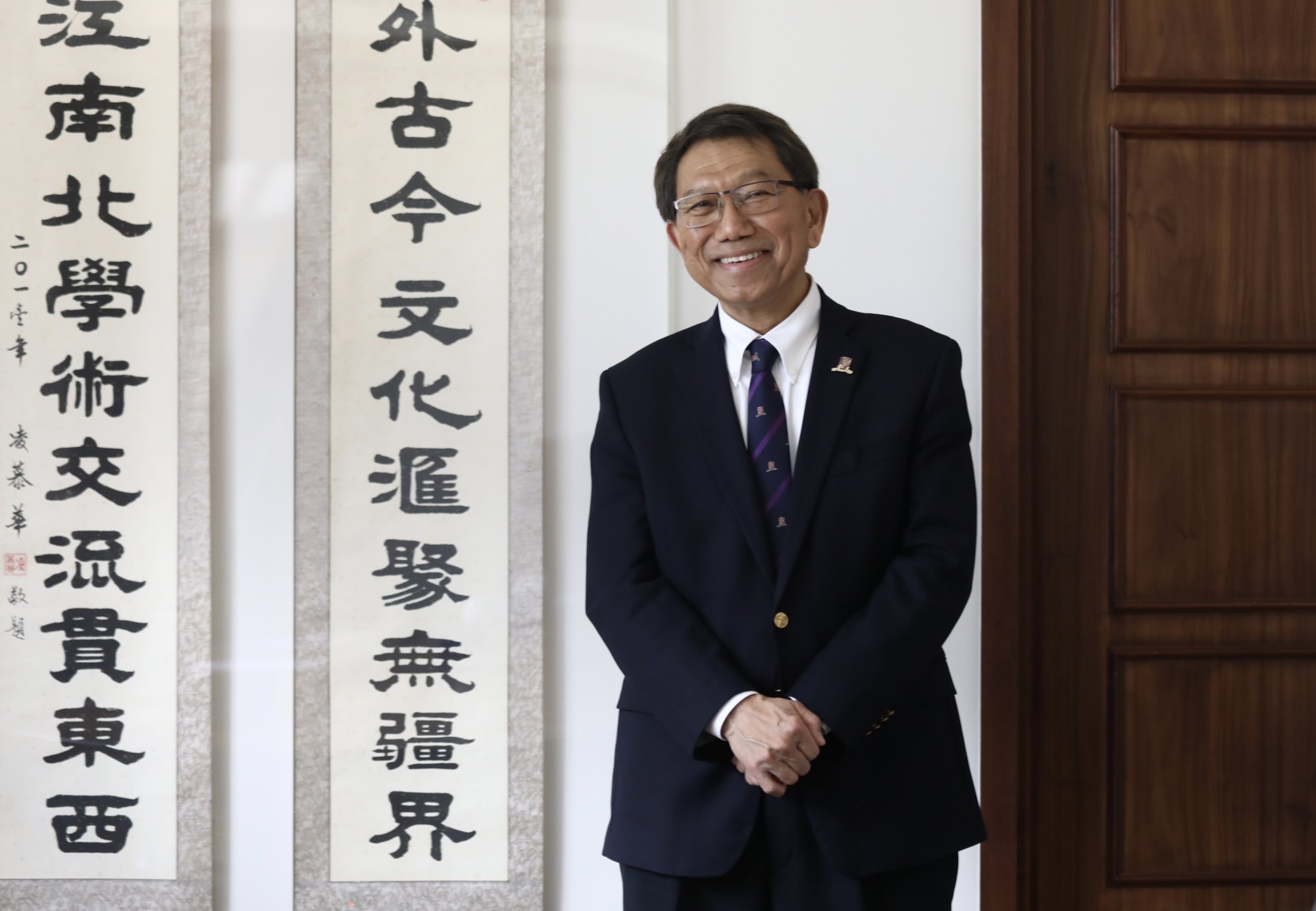
In a statement issued late on Tuesday night, the university said its council had accepted Vice-Chancellor Rocky Tuan Sung-chi’s recommendation that the emblem revert to its earlier version following a meeting the same day.
Hours before the announcement, the three lawmakers appointed to sit on the council said they had demanded an independent investigation into the redesign process, claiming the “black box” affair reflected the university’s poor governance.

“The whole saga shows the university management’s poor governance,” said lawmaker Tommy Cheung Yu-yan, also a member of the administration’s key decision-making body, the Executive Council. “We were told that the rebranding exercise began in August 2019, but ever since [then], the council has never been consulted, neither on the new branding nor on the cost involved.
“It is impossible for the university to push for something at all costs just because someone says it is good, without even taking into account the cost involved. It was totally a black box operation.”

Earlier on Tuesday, Priscilla Leung Mei-fun, chairman of the Legislative Council’s panel on education, criticised the university management’s treatment of the council.
“It is a public university and the public representatives are appointed to the council to monitor the university’s operation,” Leung said. “If council members are only notified after a decision is announced, how could they be expected to do their job properly?”
The university unveiled the simplified logo last week. Instead of a golden phoenix on a purple background shown in two halves using a reversed colour format, the logo presented the elements using a single colour for each.
The rebranding, part of the university’s efforts to mark its 60th anniversary next year, also came with a “simplified version” for use on social media platforms, which removed the university’s motto written in four Chinese characters that stated: “Through learning and temperance to virtue.”
Tuan last Wednesday said the revamped crest would appear more striking on a variety of media platforms than the previous one.
But pro-establishment figures accused the university of removing elements fundamental to Chinese culture without conducting a consultation beforehand. Former city leader Leung Chun-ying accused Tuan of treating the institution as if it were his own.
As the row escalated, the university restored the previous emblem on its website and social media pages on Monday, without any formal announcement.


