Advertisement
Advertisement
Hong Kong MTR
Get more with myNEWS
A personalised news feed of stories that matter to you
Learn more
A young passenger at the new Kai Tak MTR station stands against a wall that is splashed with Abe Au’s calligraphic work depicting the area’s name. Photo: Winson Wong

Writing on the wall: Hong Kong’s MTR stations are retired architect’s ‘museum of calligraphy’

  • Abe Au has gathered an international following for his distinctive brushstrokes in MTR stations
  • Long a feature of Island line stations, his calligraphy will appear along newest Tuen Ma line
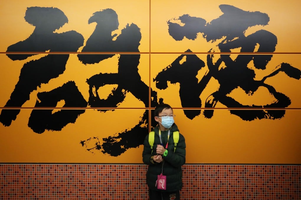
Regular passengers waiting for trains at many stations of the MTR’s Island line in Hong Kong are familiar with the distinctive Chinese calligraphic script in signage and designs on walls.

The vigorous running scripts known as xingshu have individual strokes that seem to flow and move. Some say the characters for “Tin Hau” appear to fly, while others seem to dance.

The calligraphy is the work of Abe Au Kit-tong, 71, a retired MTR Corporation architect who has been practising Chinese ink-and-brush writing every day since the age of seven. His work also appears on the platform walls of stations along the Tseung Kwan O line.
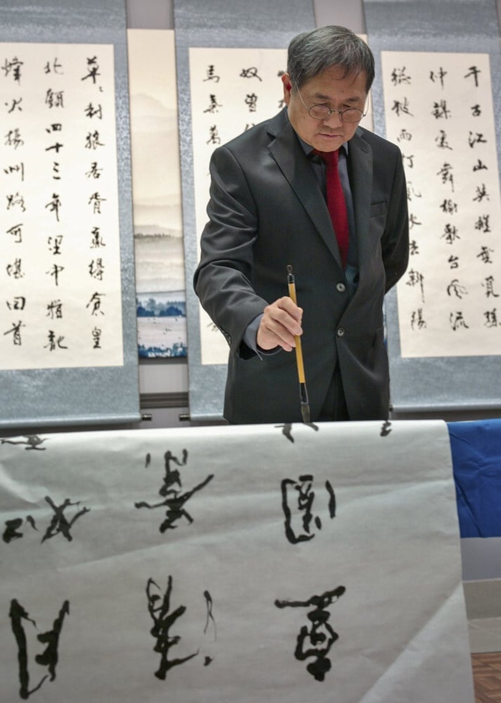
His calligraphy will feature in the Tai Wai-Hung Hom section of the Sha Tin to Central link, also known as the Tuen Ma line. It is Hong Kong’s costliest rail project at HK$90.7 billion (US$11.7 billion).
Abe Au demonstrating his artform. Photo: Handout

The Tuen Ma line is the city’s longest rail corridor running about 56km through 27 stations. The first phase, connecting Wu Kai Sha and Kai Tak by way of Tai Wai, Hin Keng and Diamond Hill, opened in February last year.

The rest of the line opens on Sunday, running from Kai Tak to Hung Hom through Sung Wong Toi, To Kwa Wan and Ho Man Tin.

“I hope passengers can feel the rhythms of calligraphy, and be relaxed and comfortable when they are on the platforms,” said Au in an interview from Calgary, Canada, where he lives.

MTR Corporation to give Hong Kong rail enthusiasts rare glimpse behind scenes

Au considers himself an amateur, and it was by chance that his calligraphy was first used along the Island line when it opened in 1985.

His boss at that time, the late Romano Paoletti, a British-Italian architect, wanted to use art to soften the platform environment of the underground stations.

“He appreciated my calligraphy very much and suggested using my Chinese handwriting for the station names on the walls,” Au recalled.

At first he doubted that his skill was good enough, but he was soon delighted that his scripts were well received by the public.

Visitors on open day for the new Sung Wong Toi MTR station on the Tuen Ma Line. Photo: Nora Tam

“Calligraphy is a form of art. Using strokes of the brush, you create different rhythms and textures that are musical. Some foreigners think Chinese calligraphy is like characters dancing,” he said.

Au, who teaches calligraphy in Calgary, said his work on display in Hong Kong has attracted numerous fans, including from overseas and especially Japan.

“People from around the world appreciate it. My students even say that the MTR has become my own calligraphic museum,” he said with a chuckle.

Diamond Hill MTR station. Photo: Winson Wong

Quentin Cheng Hin-kei, spokesman for the commuter concern group Public Transport Research Team, agreed that Au’s calligraphy was a unique feature of the MTR stations and helped liven the environment. 

“The script is like a trademark of the MTR, showing a distinct Hong Kong culture and making the railway environment less dull than if standard Chinese fonts were used,” he said. 

For the Tuen Ma line, Au stayed with the classical xingshu style of running scripts used widely in the Song dynasty (960 to 1279), to reflect the historic significance of the rail line.

At Sung Wong Toi station, for example, a large number of relics dating to the Song-Yuan period (960 to 1368) were found during excavation for construction. They included an ancient well and water channel.

His personal touch is evident at other stations, where he used freestyle semi-cursive scripts.

Xingshu is a very lively and liberal script, allowing the penman to express himself freely and exude a personal style,” he said.

To Kwa Wan MTR station opens for the media. Photo: May Tse

Among the station names, he said “To Kwa Wan” and “Sai Wan Ho” made for smoothly-flowing strokes and characters, whereas “Quarry Bay”, “Shau Kei Wan”, “Hung Hom” and “Sung Wong Toi” proved more difficult to express.

“To write ‘Hung Hom’, I tried 42 times, as ‘Hom’ is a very difficult word. You need a delicate balance and contrast between the characters by applying the brush with different degrees of weight. We call this the ‘golden proportion’,” he said.

A commuter takes a selfie at Causeway Bay MTR station. Photo: Nora Tam

Born and raised in Hong Kong, he was drawn to Chinese culture at an early age and learned calligraphy first in school and later from calligraphy masters.

Practising the art gave him a peaceful feeling, said Au, who moved with his family to Canada in 1998 after leaving the MTR Corp.

He said he was not paid for the calligraphic work he produced as a favour to the MTR Corp, adding he would be happy to continue doing so as long as there was interest.

“There is no retirement for calligraphy,” he said.

2