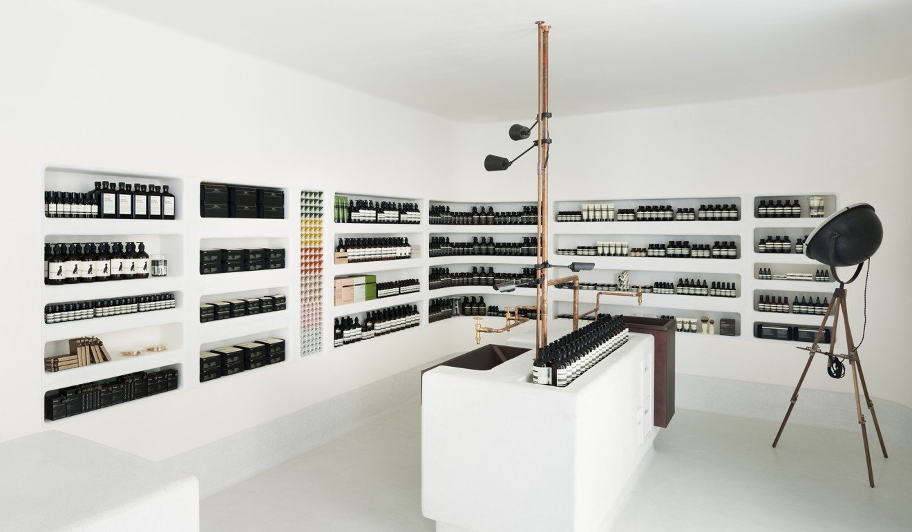
The Aesop store on Kawaramachi Street, Kyoto has a minimalist black-and-white palette. Photo: courtesy of Aesop
The founder of the Australian hair and skincare brand, Dennis Paphitis, challenges architects to fit each store to its surroundings and community; newly renovated Central store features recyclable materials

The lure of e-commerce’s instant gratification and convenience has made it more important than ever that physical stores make shopping a memorable experience.
While many have turned to creating a consistent formula of exclusive materials and artworks, until now surprisingly few have followed the example of the Australian botanical hair and skincare brand Aesop, which has created unique looks for each of its 177 stores and 84 department store counters in 20 countries.
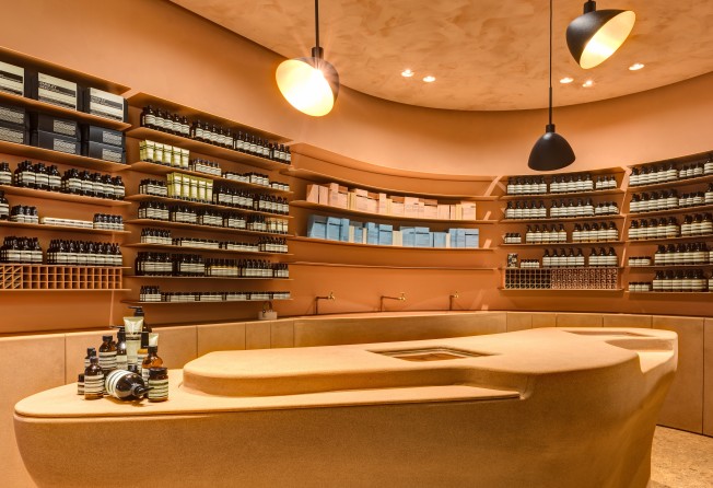
There are nine stores and four counters in Hong Kong. The first shop opened in 2005 in Lyndhurst Terrace. Its store in the International Finance Centre has been newly renovated on the cusp of the company’s 30th anniversary this year.
What once seemed like an idiosyncratic design-led strategy driven by Aesop founder Dennis Paphitis’ penchant for craftsmanship and culture now seems like a creative alternative to the uniformity of today’s retail landscape.
“No one else would think about designing a building or a house to suit any or every context. I think it is perfectly natural to consider the floor plan, streetscape and wider community for each space,” Paphitis says. “This approach also enables a different scope and landscape, which is good for the architect because it challenges them rather than having a signature look.”
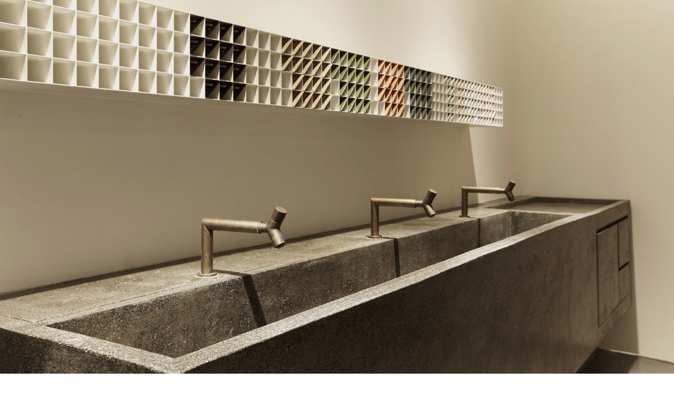
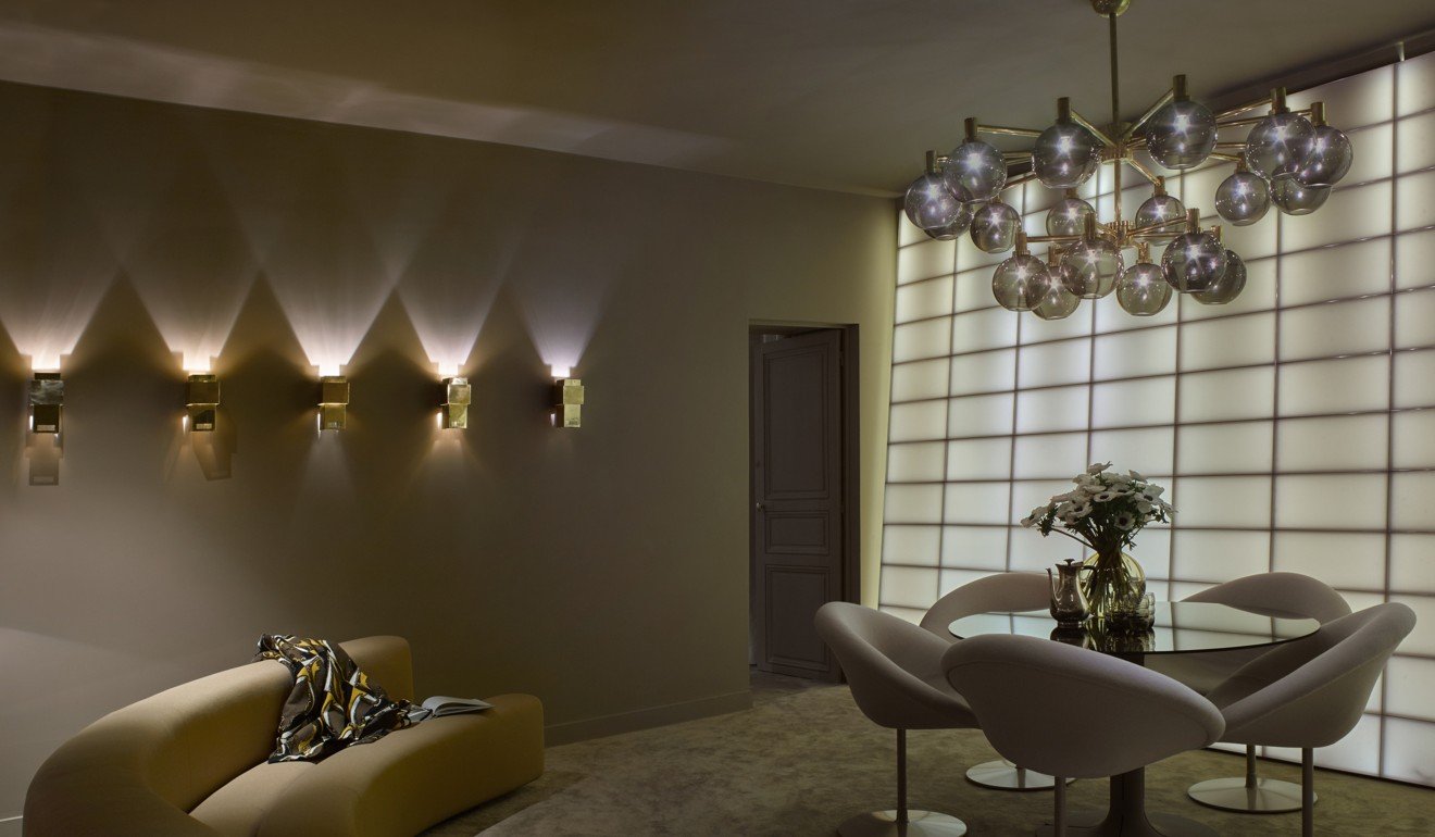
In Paris’ Rue Vieille du Temple, the compact, 24 square metre store, by French designers Ciguë, sports polished off-white concrete interiors with bottles and jars perched upon 427 tiny steel caps embedded in the wall.
“We wanted to reflect the city and the street with this sort of industrial product,” Ciguë co-founder Hugo Haas says. “We also liked the idea of the caps levitating and so played around with the different sizes, rusting some and darkening others to create a strong graphic pattern on the wall.”

Paphitis asks designers to think creatively about a premises’ existing attributes– whether there may be old floor tiles or brickwork, for example – while finding innovative ways to display products.
“It just feels less pretentious to save something, if you can,” the former Melbourne hairdresser says.
Still, there are some things that don’t change.
“Every single shop is aesthetically different but the functional requirements are always the constant,” he says. “We need water, a cash desk, a seat and storage. These parts do not vary across our stores.”
Even in the early stages of Paphitis’ career , his eye for design was obvious, with his hair salon evoking a serene sanctuary and products packaged in plain pharmaceutical-style bottles.
Jeremy Barbour of New York’s Tacklebox Architecture admits he was surprised to find himself invited to Australia after his studio was approached by Paphitis to pitch a design for a small temporary kiosk in New York’s Grand Central station.
“From the minute I stepped onto their home turf the conversations were about art, literature and food – everything other than their product,” Barbour recalls.
“Other clients sell who they are, but we had a lot of conversations about what they have an affinity for, so we didn’t have a contrived surface reading of their values. Instead, we got an idea about what is at the core of the brand.”
Other designers who have worked with the brand say that although Paphitis is notoriously fastidious about design details, in general they enjoy considerable creative freedom. Although renowned designers, such as Studioilse and Torafu Architects, are responsible for some of Aesop’s stores, the brand has a tradition of hiring young, emerging architects. In 2015, the brand launched “Taxonomy of Design”, a digital archive of its stores with profiles and filmed interviews with some of their designers, alongside details of materials and furnishings.
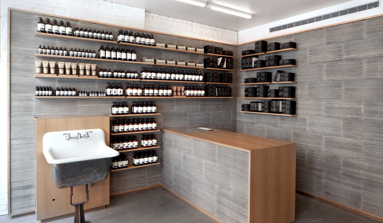
Approaching each space with a different design strategy is not for the faint of heart. It is an expensive, high-risk strategy that flies in the face of traditional economies of scale. The advantages, however, extend beyond pure aesthetics to provide greater flexibility regarding reuse of building and decorative materials. Many of Aesop’s interiors incorporate vintage or salvaged items, such as sinks, taps and tiling, in novel ways.
For example, at Chicago’s Bucktown store, Norman Kelley created a distinctive grid motif comprised of reclaimed Chicago common bricks.
At the newly renovated Aesop store in the IFC, Paphitis says he challenged the newly established local design studio Mlkk to investigate recyclable materials for a design that could be easily updated. After research into regional timbers, the team of young designers came up with an organic, Chinese eucalyptus, cork-lined interior featuring a curvilinear counter.
“Cork is a very sustainable, humble material that offers a contrast to the shininess of the mall, but at the same time we also wanted a design that would offer a high-end aesthetic quality,” Mlkk co-founder Kian Yam says. Yam worked as an in-house architect at Aesop before co-founding the studio.
Although Paphitis is no longer involved in day-to-day management of the design of each store, he remains a key strategic creative force within the business.
“As digital grows we can be even more selective in our stand-alone stores as the purpose of them extends to include other things like customer events,” Aesop chief executive Michael O’Keeffe says.
“Our customers replenish stocks online but go into the stores because of the relationships. It is not just about the product and experience of design; it also extends to service with a human touch. Digital will become the connector between all of this.”
Although all Aesop stores are designed to reflect their local context, the brand’s latest project – a beauty pop-up on Rue Saint-Honoré in Paris that runs until July – is all about disconnecting from time and place.
According to owner Dennis Paphitis, the idea arose when Benjamin Paulin, son of the late avant-garde French designer Pierre Paulin, was passing Aesop’s store in the Rue Condorcet in Paris, and spotted a vintage armchair designed by his father. The chair had been chosen by the company’s in-house designer, Jean-Philippe Bonnefoi, and reupholstered in nude coral pink.
Paulin inquired about the interest in his father’s work, and he and Bonnefoi hit upon the idea of transforming the company’s temporarily empty office space into a treatment space decorated with Pierre Paulin’s designs.
“This was not a brand ‘collaboration’ but more of an accidental friendship that evolved into a personal experiment,” Paphitis says. “This is not something that could have been strategised.”
The pop-up, which Paphitis says “feels like you’ve walked into an apartment of an older Parisian couple”, comprises three understated, serene rooms in neutral tones of mushroom and taupe, furnished with Paulin’s furniture and lighting.
The first space is an entrance reception and features Paulin’s Tanis desk and Anda chair, produced by Ligne Roset. Bonnefoi designed an LED-lit wall of 12 wax panels made from melted-down church candles that diffuses the natural daylight in the middle room.
The third room is where the treatment takes place and includes a leather Elysée chair and a pair of (soon to be reissued) vintage Elysée floor lamps.
“It is not an exhibition of Paulin furniture because each piece comes from a different time and was chosen to be functional and to help create a special atmosphere,” Paulin says. “It also offers a new kind of organic environment that is not at all clinical.”