Homage to the Square (1970) by Josef Albers. Photo: courtesy The Josef and Anni Albers Foundation and David Zwirner


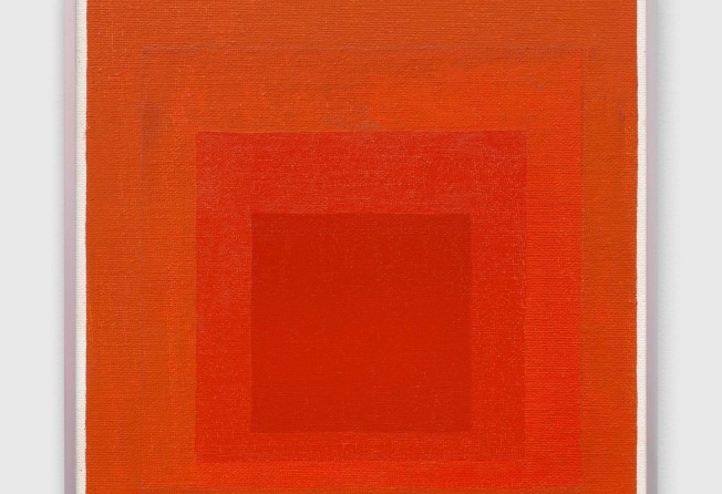
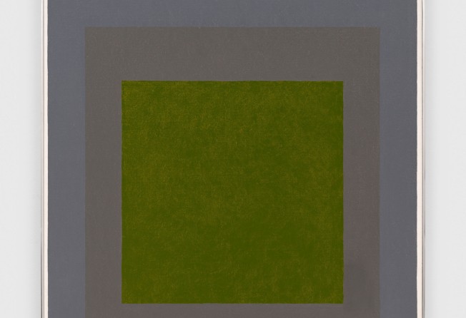
Josef Albers’ squares only begin to make sense when you see them in person. The formulaic progressions of three or four of the shapes may seem flat, cold and mechanical in reproductions. But up close, they flicker and come alive.
Unevenness is created by the scraping of paint with a small palette knife across the primed surface of a compressed wood board, the varying thickness of the paint allowing specks of the white background to come through. Sometimes the edges of the squares waver. The artist was not aiming for perfection. Instead, he was demonstrating.
Obsessives can be terrible bores, but just what drove Albers (1888-1976) – one of the most influential Modernist artists, who taught Eva Hesse, Robert Rauschenberg and Richard Serra among many others – to make more than a thousand different versions of Homage to The Square from the age of 62 until he died over 25 years later is a compelling mystery, given the time that he lived in and the historical context of his practice.
The “Square” in the series title evokes Kazimir Malevich’s 1915 Black Square, that “hour zero” reset of modern art that opened the way for the rejection of narratives and mimesis in 20th-century art. But the concentric shapes are really just the support; the paintings were to pay homage to the nature of colours: what they do to us and how they react to each other in our eyes.
At the David Zwirner gallery in Hong Kong, a large selection of Albers’ works is showing until March 5. The gallery website has a video in which Albers explains that he would first use a pencil and ruler to draw three or four precise squares on a Masonite panel. Then he filled each section with a different colour squeezed straight out of the paint tube with a small palette knife, bit by bit so that he could keep to the edges fairly accurately.
Occasionally he would use mixed colours, too, as his scribbled record on the back of each painting revealed.
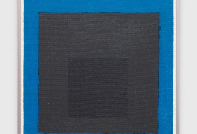
We see some combinations of colours that are nuanced gradations (different hues taken from the red family, for example); single colours with another from the same temperature spectrum (reds with yellows, blues with greens); and single-colour squares accompanied by monochrome ones.
As Albers used to say, 50 people hearing the word “red” would conjure up 50 different ideas of red in their minds. Different manufacturers of paint made colours different too. “Cadmium Green (Winsor & Newton); Mars Yellow (Grumbacher)”, and so on, he recorded precisely which product he used on each work. He could have made a lot more and still not have repeated himself.
But why did he make so many? It was as if he wanted a complete catalogue of colours to go with his 1963 book Interaction of Colour.
Perhaps it stemmed from a pedagogical urge that came with a lifetime of teaching – at The Bauhaus in Germany and, after the Nazis shut that down in 1933, in the United States, where Albers continued the Bauhaus focus on the pragmatic aspects of artmaking and design at Black Mountain College, in North Carolina, and at Yale University, in Connecticut.
In particular he taught about colours, and how they are never static but in flux depending on the viewer’s subjective experience and how different colours interact with each other. This matters, not just so that we are more aware of how we see art and the role of colour in everyday life, but because it is a principle that can be applied to other materials, music and language. Everything is similarly relational, he said.
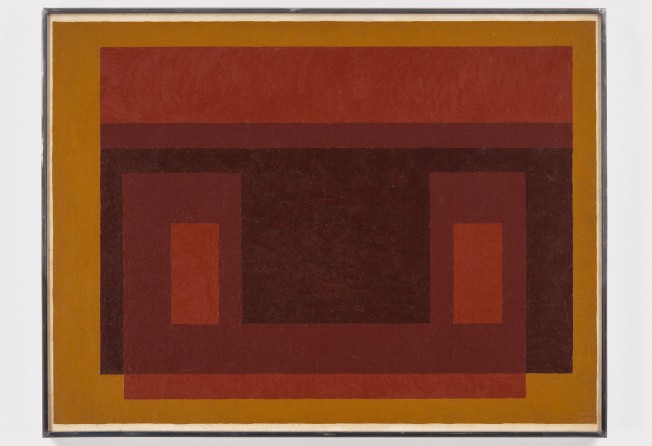
And so when we see the “Homage” series, or his “Variant/ Adobe” paintings inspired by Mexican houses, we notice how shapes come forward or retreat depending on the colour, how different hues shift depending on their neighbours, how proportions affect our perception of shapes, and, as the various titles such as Warm Welcome or Affectionate suggest, how colours sway emotions.
But even the most committed of teachers take a break from making teaching materials. By 1950, when he started the “Homage” series, he was already nearing retirement age. One can only guess why he was so persistent.
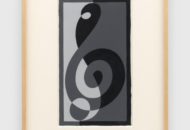
There is a painting in the exhibition called Treble Clef G n (1932-1935). The date range suggests he was working on this while he was still at the Bauhaus, and took it with him when he fled Germany in 1933 with Anni, his wife of Jewish descent who was also a prominent artist and teacher.
Later, at Black Mountain College, he would complete the piece and also paint a large number of other Treble Clef paintings, as if his practice was never interrupted by Hitler’s coming to power and the Nazi’s ordering the closure of the Bauhaus.
Perhaps to keep going was the ultimate defiance. Or it might have provided him with the infinite satisfaction of proving a theory.
“Josef Albers: Primary Colours”, David Zwirner, 5-6/F H Queen’s, 80 Queen’s Road Central, Central, Tue-Sat, 11am-7pm. Until March 5.