View this post on InstagramA post shared by thomas_fung (@thomas_fung) on
Source:
https://scmp.com/magazines/style/leisure/article/3046550/instagram-masterclass-best-colours-making-your-newsfeed Leisure
Instagram masterclass – the best colours for making your newsfeed on trend for 2020 and Lunar New Year
‘Classic blue’ has been adopted as the Pantone Color Institute’s official colour of the year – how else can you make your mobile phone photography sparkle on social media, and beyond?


Photographer Thomas Fung chooses his favourite colours for Lunar New Year. Photos: Thomas Fung
Happy 2020, and here’s to a wonderful Lunar New Year, too! As we look forward to the Year of the Rat, we spoke to our favourite colour-savvy photographer and self-professed “Pantone freak”, Thomas Fung, about his thoughts on “classic blue” (the colour of the year, apparently) and how to take amazing colour photographs with a smartphone.
The new Pantone colour of the year is ‘Classic Blue’. What are your thoughts on this particular hue for 2020, given the current state of the world?
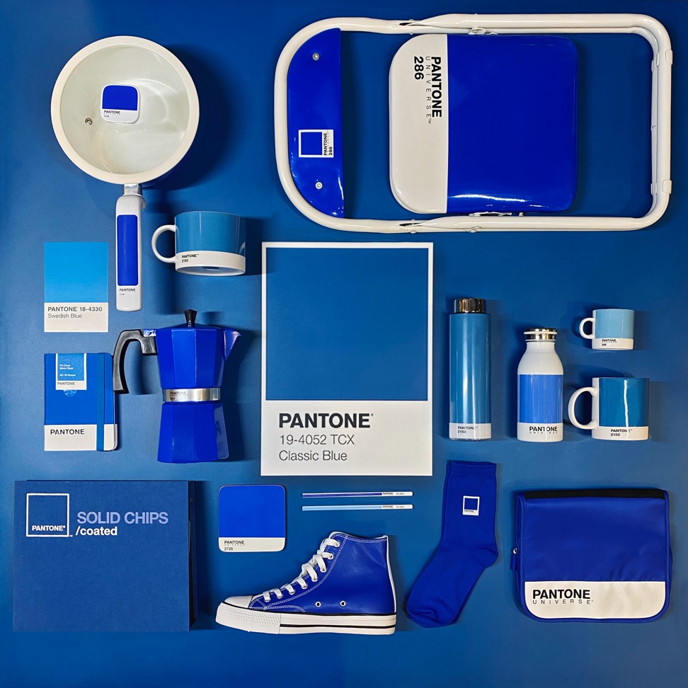
Photographer Thomas Fung's work featuring ‘classic blue’, the Pantone Colour of 2020.
I think it is a great choice. “Classic Blue” is timeless and calming. For me, it also has a unique reflective quality that helps me gather my thoughts when creating art. As we embark on a new decade of uncertainties and increasing conflict, the colour offers a sense of hope and certainty and reassures our desire for peace and tranquillity.
How does this colour compare to previous Pantone colours of the year?
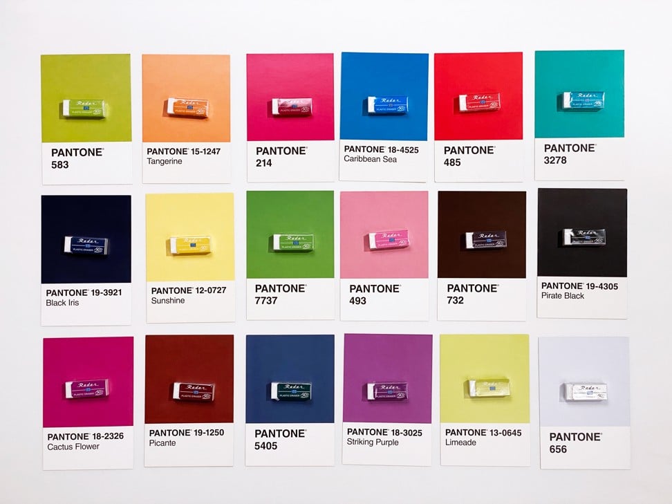
Photographer Thomas Fung tells us how to shoot with Pantone colours.
I think the colours correlate very well with the global sentiment and ongoing issues, and credit to the thoughtfulness of the Pantone Color Institute. I’m more drawn to “classic blue” as the spectrum of blue colours has always been my favourite. Having said that, the colour of 2019 – living coral – is vibrant and warm, and also offers inner peace. Personally, these two colours bring up different emotions, so it depends on our state of mind and the context of the interpretation.
How would you shoot a ‘ classic blue’ photo, and what should amateur photographers keep in mind?
The colour itself already stands out silently with character and style. I have previously created Instagram posts using a broader spectrum of blue colours and find it visually impactful. They almost speak for themselves. “Classic blue” goes with most colours as long as they do not overshadow it. Earth tone colours are the best matches. For strong or high contrast colours, the lighting really matters in bringing out vibrancy and colour accuracy.
What should one keep in mind when shooting colour with a smartphone, especially when it comes to colour accuracy?
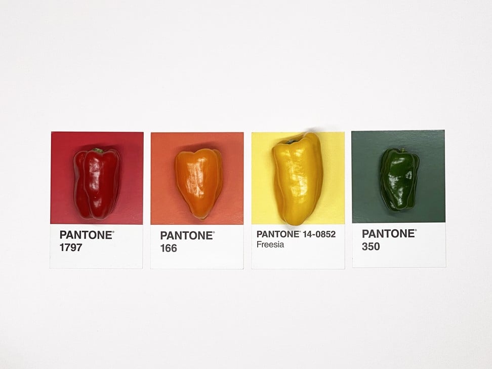
Four bright, arresting shades which are nonetheless found in nature – and the average supermarket.
I use an iPhone 11 Pro and it evidently provides the best colour accuracy compared with its competitors. Some smartphones that rely heavily on AI detection may distort colour accuracy. Taking shots under different lighting conditions and at different angles can change the results too. Post-processing software or apps are the last resort in my opinion.
How does shooting with a smartphone differ from shooting with a camera? What are the main things to keep in mind?
Smartphone cameras are now impressive and with excellent photo processing capacities you can’t tell between phones and cameras. Shooting techniques are similar, with composition and lighting being the most important factors to consider. Smartphone displays really vary so do pick high quality screens – newer iPhone models come with True Tone Retina displays, and that’s a pretty good benchmark. Checking your shots on a different monitor before publishing always helps.