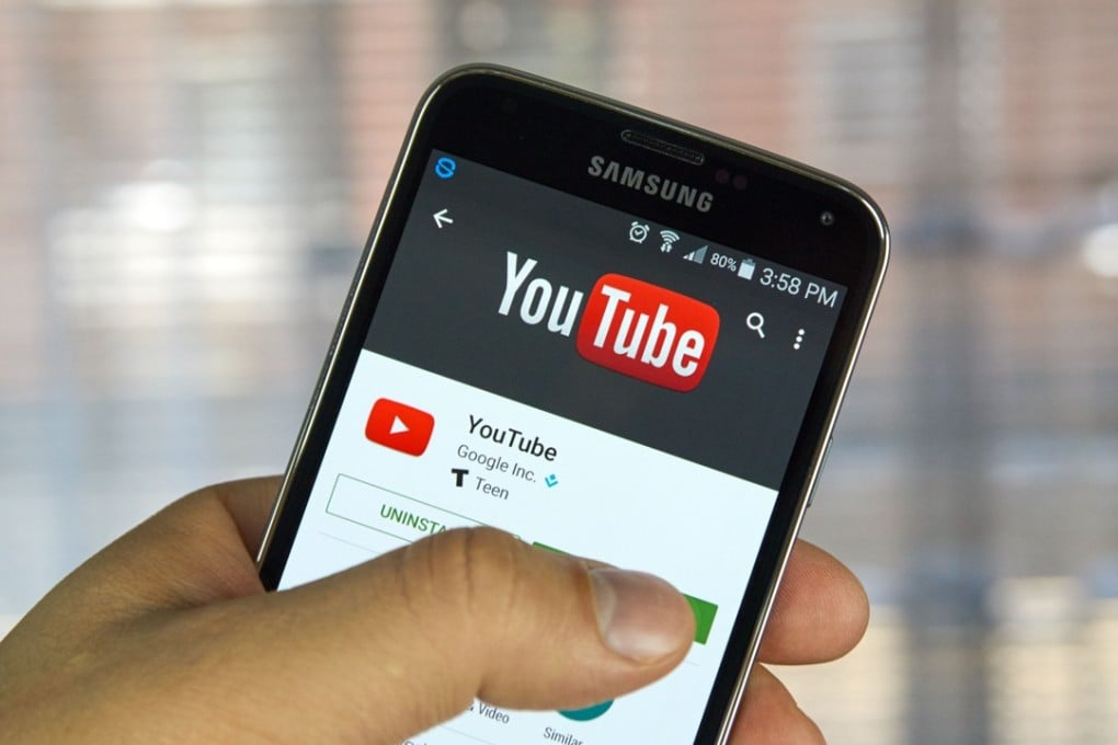
YouTube just made the biggest change to its logo in history
Company says the new logo allows for more flexibility across different devices

By Tanya Dua
YouTube is getting its biggest makeover to date.
The company’s iconic logo is getting a refresh, with the focus shifting away from the word “Tube” onto the play button for the first time. The updated logo consists of the YouTube icon — a red tube with a white screen and a red play button — followed by the YouTube wordmark in black. The logo also has a new typeface and color scheme.
According to the company, the new logo allows for a more flexible design that works better across a variety of devices, even on the tiniest screens. This is because when space is limited, for instance on smartphones, the brightened icon can be used as an abbreviated logo, which can be seen more easily.
Here’s what the YouTube icon will look like, for context:
The new logo and icon are part of a bunch of other new features that the company plans to unveil in the upcoming months, to highlight its evolution since it first started 12 years ago. YouTube is no longer just a singular website supporting video, but a suite of different apps that span across multiple platforms for everyone from music fans and TV lovers to gamers.
